
Playing With Colour In Food Photography


Do you ever consider the colours within a picture when you see a dish or a place to eat? Colour plays a crucial role in creating visually appealing food imagery, whether you’re working in a studio or on location. As a food photographer Northamptonshire, I often use colour strategically to make dishes pop and create a mood that enhances the story behind the food.
Reference:
‘The meaning of colour
Colours range from primary to territory colours and are used in photography as a non-verbal form of communication. Each colour can express a certain message or emotion in the viewer. Every colour has its own meaning & a selection of words that relate, but this can differ from person to person depending upon each viewer’s beliefs and culture.’
Read more on understanding colour in photography
For any genre of photography, colour is an important component to improve the quality of an image. Traditionally, photographers focused primarily on light and shadow, but colour is now an essential tool in restaurant photography and product photography for restaurants.
Colour Theory for Food Photography
In this blog, I plan on covering what it means to use colour combinations when planning for a food picture. Understanding colour theory will help you plan your food photography shoots, whether you’re in a restaurant, café, or working on product photography for restaurants.

Let me introduce you to colour theory, as knowing about this, will help decide on your own colour combination.

COLOUR WHEEL
Common types of colour pairings in food photography:
Analogous Colours: 2–3 colours next to each other on the colour wheel. These create calm, harmonious images (e.g., green and blue, yellow and green).
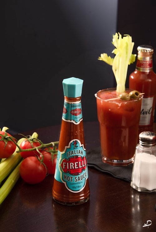
Complementary Colours: Opposite colours on the colour wheel. Using these together makes dishes stand out with cool/warm contrasts (e.g., red/green, purple/yellow).
Monochromatic Colours & Props: Use neutral plates and backgrounds in the same colour to make your food the focal point. This approach works well in restaurant photography where the setting should not distract from the dish.
This can also be related to Light mood photography

This is a small section of an image, but you can see that the colour of the tart is a complementary colour to the table that the plate is on.
Applying Colour in Your Food Photography
After reading and understanding colour theory, you need to start to put this into practice, so that your food images show delicious food because you have chosen the correct key colour combinations. Here are some stages to get you started:
Start by choosing your main colour
Colour should be used to enhance your image (Choose a secondary colour that makes your dish jump out off the screen.)
Choose colours that reflect your style and the type of the dish you are shooting (Light and bright colours will reflect the summery feeling. Darker colours, on the other hand, are perfect if you want to create a cosy winter setup)
Don’t use too many colours
Consider using warm or cool colours as these will determine the mood of the image. Combining cool and warm colours in an image will create visual contrast
Technical Considerations
White Balance: Ensure your white balance is correct to avoid colour casts that alter the appearance of your food.
Desaturate Colour: Adjusting saturation in editing can help form a signature style for your food photography.
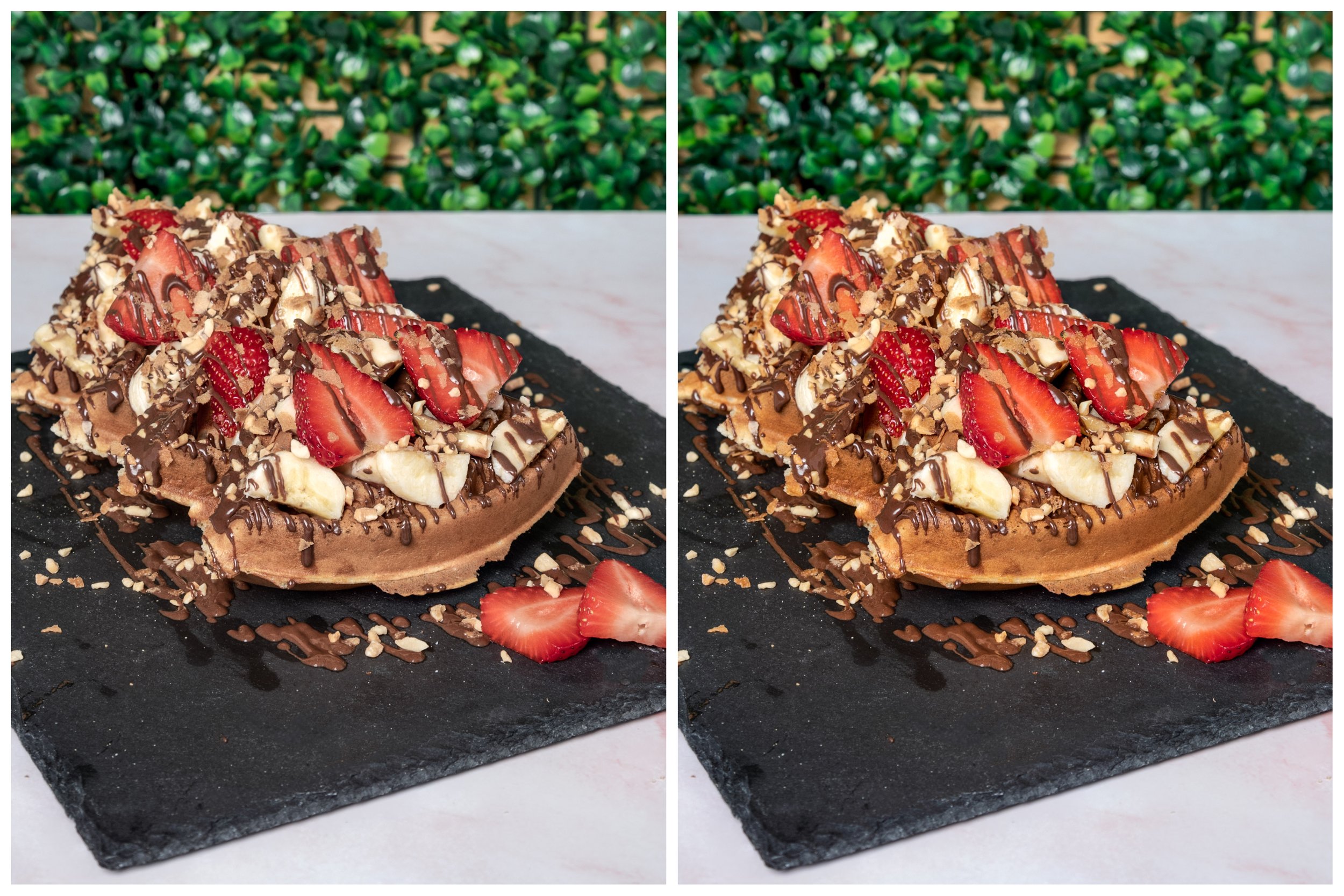
Here’s an example: I have taken away some of the overall colours in one image while boosting reds, yellows, and greens. In another image, the warm tones are enhanced to create a cozy, inviting feel. Both demonstrate how thoughtful colour use can elevate your food styled photography.
Here is an example of an image with a warm and a cool colour cast
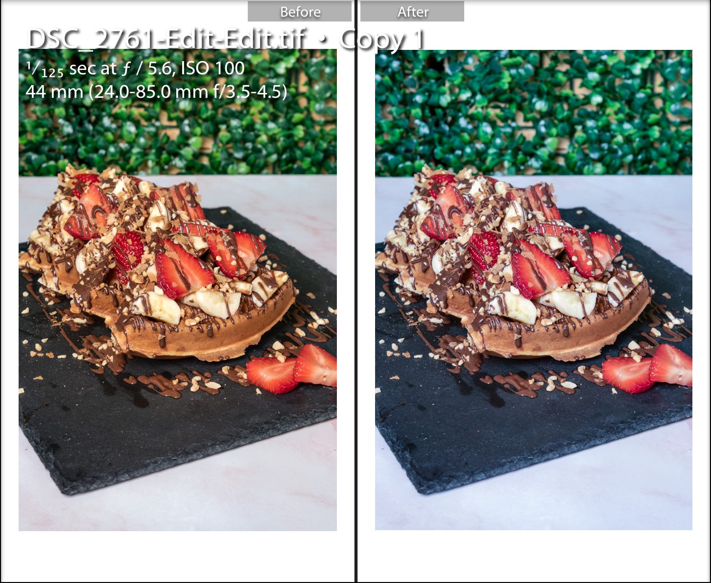
You can visually see the difference between the two images, so either in the photography stage or edit stage amend any colour issues when required or you may wish to deliberately have a cooler or warmer look to the final image.
This leads to desaturating the colour. This is when you decide to remove the colour intensity and this could help form your own food photography style if this technique is used in all of your food photography. When using colour, it is not always colourful and this is something to play with and not be afraid of.
Here is an example of where I have taken away some of the colours, take a look at the difference.
Image 1 I have taken away the overall colour and increased the reds, yellows and greens
Image 2 is the warm coloured picture
Final Thoughts
Whether you’re working as a Food photographer Northamptonshire, shooting restaurant photography, or creating product photography for restaurants, playing with colour is essential to make your images stand out. Proper use of colour not only highlights your food but also conveys mood, complements your brand, and engages your audience.
What’s Next?
Enjoyed this post? Drop a comment below and let us know your thoughts!
Subscribe for More: Get monthly tips, tricks, and inspiration to elevate your photography skills.
Take Your Skills Further: Level up with one-to-one personalized tutorials and transform your food photography.
Book a Professional Session
Need professional imagery for your brand?
Collaborate with a specialist in restaurant photography, food photography in Northamptonshire, or product photography for restaurants to create stunning visuals