
The power of the palette: Why colour is your secret ingredient


When we talk about food, we almost always talk about taste. In photography the split second someone decides whether to stop scrolling or keep going, as we eat with our eyes first.
The most powerful seasoning you have in food photography isn't a filter or a fancy lens. It's colour.
As a food photographer here in Northamptonshire, I've seen first-hand how the right colour palette can turn a simple dish into an emotional experience. Not just something that looks pretty, but something that triggers a genuine craving. Used well, colour tells a story, builds brand recognition, and does a remarkable amount of persuasive work before a single word is read.
Here's how to use it intentionally and no art degree required.

COLOUR WHEEL
You don't need to memorise the colour wheel. Just understand the three relationships.
The colour wheel is simply a map that shows which colours work together and why. There are three relationships worth knowing, and once you see them, you'll spot them everywhere.
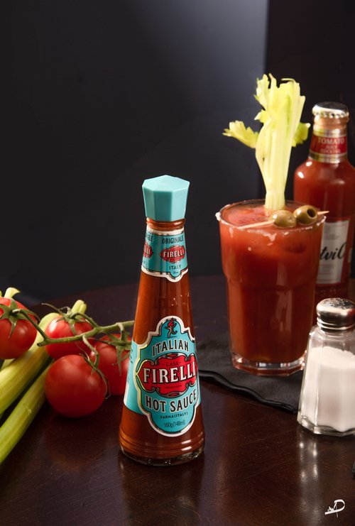
Complementary colours sit directly opposite each other on the wheel. Put them together and they create instant high contrast, making each colour look more vivid and alive than it would on its own.
In practice: imagine a bright orange carrot soup served in a deep blue ceramic bowl. The blue doesn't compete with the soup, it amplifies it. The orange looks warmer, richer, and more appetising than it ever would on a plain white plate.
Analogous colours sit next to each other on the wheel. Used together, they create a harmonious, calming feel that reads as natural and considered rather than designed.
This is the palette of rustic, autumnal food. A golden pastry, orange roasted squash, a warm wooden tabletop. It's the visual equivalent of comfort food.
Monochromatic means working with different shades and tints of a single colour. It's a more modern, high-end approach that feels sophisticated and clean, and it shifts all the visual interest onto texture rather than colour contrast.
Think of a green salad on a pale mint plate with a deep forest green linen napkin. The eye has nowhere else to go but the food itself, which is exactly where you want it.

This is a small section of an image, but you can see that the colour of the tart is a complementary colour to the table that the plate is on.
Colour has a temperature and that temperature changes how people feel
Beyond which colours you use, how warm or cool your palette reads has a real effect on the mood of an image and how a customer responds to it.
Warm colours, like reds, oranges, and yellows, are genuinely known to stimulate appetite. They feel energetic, comforting, and inviting. There's a reason so many food brands lean into this end of the spectrum.
Cool colours, like blues, greens, and purples, feel fresh, calm, and premium. Blue is rare in food itself, but as a backdrop or prop colour it works brilliantly, because it creates such strong contrast against the warm tones of bread, meat, pasta, and most cooked dishes. It's an underused trick that instantly makes food look more vibrant.
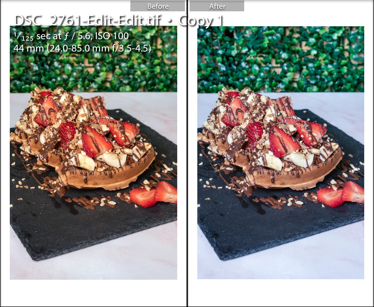
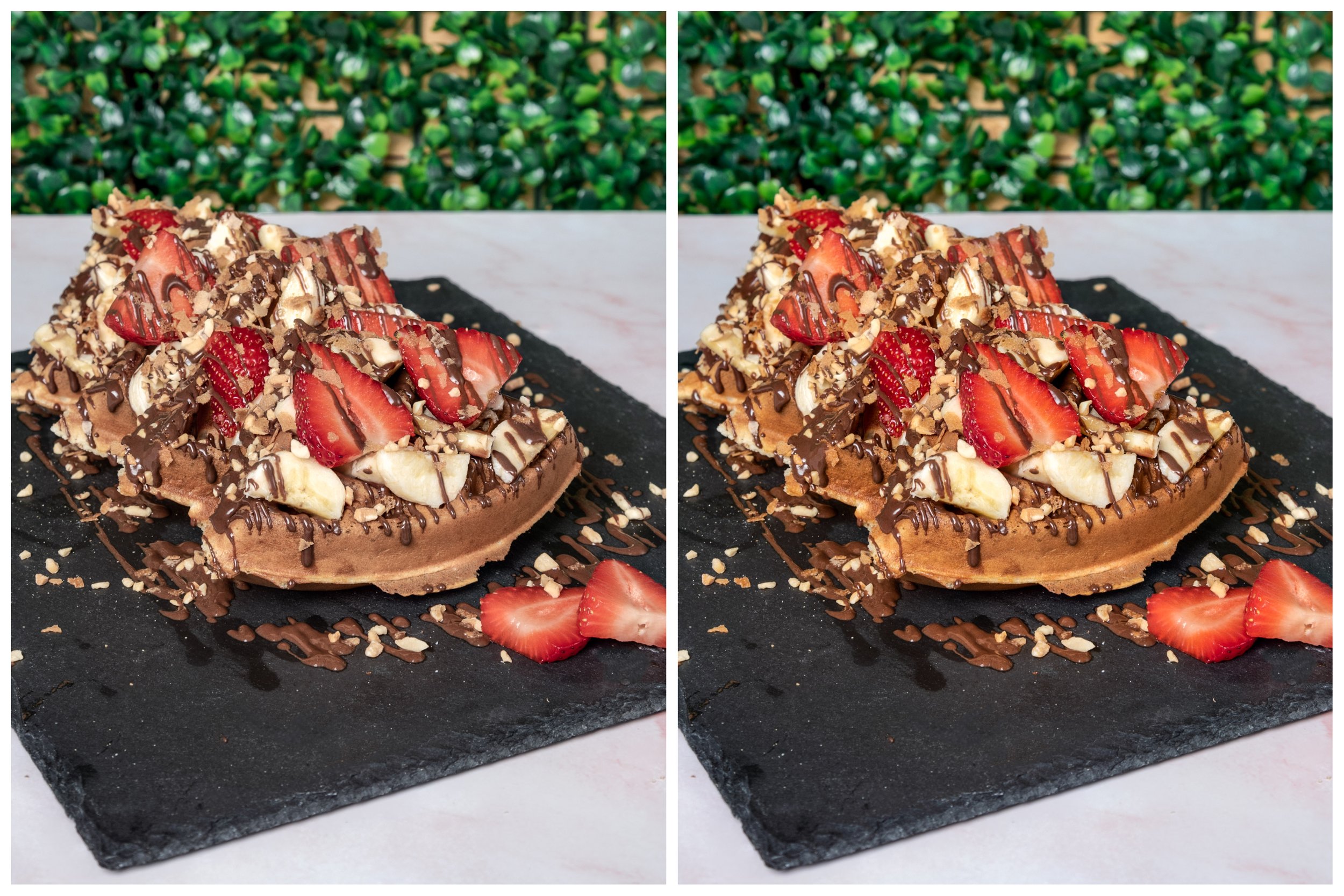
You can visually see the difference between the two images, so either in the photography stage or edit stage amend any colour issues when required or you may wish to deliberately have a cooler or warmer look to the final image.
This leads to desaturating the colour. This is when you decide to remove the colour intensity and this could help form your own food photography style if this technique is used in all of your food photography. When using colour, it is not always colourful and this is something to play with and not be afraid of.
Here is an example of where I have taken away some of the colours, take a look at the difference.
Image 1 I have taken away the overall colour and increased the reds, yellows and greens
Image 2 is the warm coloured picture
Why this is a business decision, not just an artistic one
Using colour intentionally isn't just about making your photos look good, it's about making your brand recognisable and consistent.
A high-contrast complementary palette stops the scroll on social media. An earthy analogous palette tells the story of a farm-to-table café without a single caption. A bold, clashing colour scheme communicates the energy of a cocktail bar before anyone reads the menu.
Your colour choices are communicating something about your brand whether you've thought about them or not. The question is simply whether they're saying what you want them to say.
Ready to make your menu irresistible?
Colour is one of the most underestimated tools in a food brand's kit and once you start seeing it, you can't unsee it. Whether you'd like me to handle the creative direction for your next shoot, or you want to develop these skills yourself, I'm always happy to help you figure out the best next step.
Need me to handle the styling and the shoot? Explore my Food & Drink photography services.
Prefer to develop these skills yourself? Book a 1-on-1 Photography Masterclass.
Just want to talk through your brand palette? Book a free 15-minute consultation, let's figure out what would work best for you.
Sam Peel (MA) | Welly Pictures | Food Photographer, Northamptonshire Originally published for Chatting Food