
Light and bright: Why airy food photography is your brand's best friend

Let me ask you something.
When you look at a food photo, how do you want to feel?
Do you want to feel the warmth of morning sun on a breakfast table?
The crisp, clean freshness of a summer salad?
That light, airy quality you see in the best food imagery isn't a happy accident, it's a deliberate creative choice. And it's one of the most powerful things a food brand can get right.
As a food photographer here in Northamptonshire, I work with restaurants and food brands to move beyond "just a picture" and create what I call a visual appetite, imagery that makes someone feel something before they've even read the menu. A light and bright mood conveys freshness, quality, and care. And those are exactly the things that make a customer click "book now."
Here's how to create it, no jargon required.

Keep the background quiet
The secret to the light and bright style is simplicity. You want the food to be the undisputed star of the frame and everything else is just there to support it.
Whites, creams, and pale greys are your best friends here. A neutral surface stops the background from competing with the dish, so the viewer's eye goes exactly where you want it. Light-coloured plates and linens do the same job, as they keep the whole image feeling airy and inviting rather than busy and cluttered.
When in doubt, take something out. Less almost always works better.
Control the light (without any fancy kit)
Natural light is the gold standard for this style, and a big window is genuinely all you need to get started.
Position your light source, the window, to the left, right, or slightly behind the dish. Then use a piece of white card on the opposite side to bounce light back in and fill those shadows. It keeps everything looking clean and high-end, and it costs nothing.
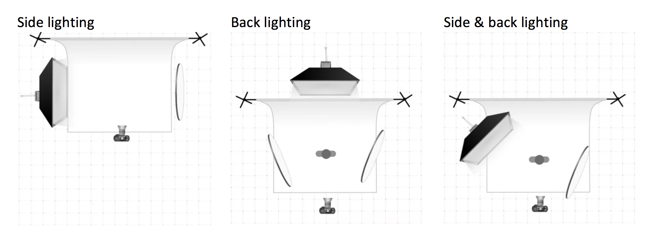
The above lighting diagrams show the camera, reflector, background and light source position. In the first image, the light source is positioned to the left. The 2nd image has the light as a backlight, which works amazingly with glass objects, and the 3rd shows two forms of lighting.
The lighting position per picture or mood is the same. However, for the light/bright mood picture, use reflectors to diffuse harsh shadows.

This image is nicely lit, but to make it a Light/Bright mood picture, I would work on diffusing the arrow-shadowed areas and I would use a neutral background sheet.
The other thing to watch is harshness. You want soft, gentle shadows that add a little depth, not dark, dramatic lines that pull focus. A sheer curtain or a sheet of tracing paper over a lamp softens artificial light beautifully. The goal is always to make the light feel effortless, like the food just naturally looks this good.
Give the eye a map
How you arrange things in the frame tells the viewer where to look and a little structure goes a long way.
The rule of thirds is a simple starting point: imagine your frame is divided into a grid of nine equal squares and place your main dish where the lines intersect rather than dead centre. It creates instant balance without looking staged.

From there, a triangular arrangement works brilliantly, with your main dish, a drink, and a small prop like a folded napkin. The eye travels naturally between the three points, and the whole thing feels lived-in rather than overly styled.
Here are some examples of this composition


Play with your angles
Two angles do most of the heavy lifting in food photography, and both have their place in the light and bright style.
The side shot is perfect for dishes with height, layers, or texture. A cake, a burger, a beautifully garnished cocktail. Shooting from the side with a wide aperture (that soft, blurry background effect) makes the dish feel dimensional and draws the eye straight to it.
The flat lay, which is straight down from above, is your hero shot for table spreads, colourful dishes, and anything where the top tells the whole story. Keep your camera perfectly level. Even a small tilt shifts the whole composition, and it's the kind of thing that's obvious once you see it.
Why this matters for your business
Photography isn't a nice-to-have for a restaurant or food brand, it's a strategic asset and the light and bright approach earns its place for very specific reasons.
It emphasises freshness, bringing out the vibrant colours and textures that make food look genuinely appetising. It builds trust, consistent, professional imagery signals to potential customers that you care about the details, which makes them more confident about booking. And practically speaking, clean bright images perform exceptionally well on Instagram and websites, turning browsers into diners in a way that dark, moody shots often don't.
Your photos are working for you around the clock. They deserve to be doing a good job.
Ready to Make Your Menu Irresistible?
Applying even a few of these ideas will make a real difference to how your brand shows up online and that directly affects how people feel about your food before they've ever tasted it.
Not sure where to begin, or what would make the biggest impact for your specific brand? I'm always happy to hop on a quick call and brainstorm some ideas with you, no pressure, just a friendly chat.
Need me to handle the styling and the shoot? Explore my Food & Drink photography services.
Prefer to learn these skills yourself? Book a 1-on-1 Photography Masterclass.
Just want to talk it through? Book a free 15-minute consultation, let's figure out the best next step for you.
Sam Peel (MA) | Welly Pictures | Food Photographer, Northamptonshire Originally published for Chatting Food.