Apple Pie Photography Tips | Food Styling & Flat Lay Ideas
I wanted to walk you through my own process for a real shoot, the kind I do for my own social media promotion.
Most of the images I post aren't grabbed casually, they come from set photography sessions I plan. Each month, I like to map out food days, wellbeing days, and seasonal celebrations in my calendar, so I always have something ready to share on the day it matters. This shoot was planned around #ApplePieDay, and what follows is the thinking behind it, from start to finish, with no jargon, just the actual decisions I made.
Choosing the shot
I wanted a picture that celebrated the pie itself, by either the whole thing, or a single slice. The pie I had was a little smaller than I'd hoped, so I focused on getting a genuinely appetising shot of the crumbly pastry texture on top, since that was the star of the dish.
For the setup, I went with a classic flat lay, with camera positioned directly above the pie, looking straight down and lit with a simple one-light studio setup. You really don't need a complicated lighting rig for this; one light, positioned thoughtfully, is often all you need.
1. Choosing the right background
This sounds like a small decision, but it makes a huge difference.

Image: apple pie on a wooden background
Here I tried a wooden background, which gave two nice textures side by side, with the crumbly pastry and the grain of the wood. The problem was that the colours were a little too close together, so the pie didn't stand out as much as I wanted.

Image: apple pie on a smoother, contrasting surface
I preferred this option instead. The surface is smoother than the pie's texture, and the colour contrast makes the pie the clear focal point of the image, which is exactly what you want the eye drawn to.
A gentle intro to colour theory
Colour theory sounds like something reserved for art school, but it's genuinely one of the simplest, most useful things you can learn for food photography. Two ideas are worth knowing:
1. Complementary colours — colours sitting opposite each other on the colour wheel. Because they contrast strongly, pairing your food with its complementary colour makes the dish pop against the background.
2. Analogous colours — colours sitting next to each other on the colour wheel. These create a calmer, more harmonious feel, since they're naturally similar tones.
Why does this matter? Because thinking about colour, for both the food itself and the props around it. Us one of the easiest ways to lift an image from "fine" to "eye-catching."

An apple pie sits in the red, red-orange, and orange part of the wheel, these are analogous to each other. The background I liked best was a blue-black tone, which sits opposite those colours on the wheel, making it a complementary choice and that contrast is exactly why it worked so well against the pie.
2. Choosing complementary props

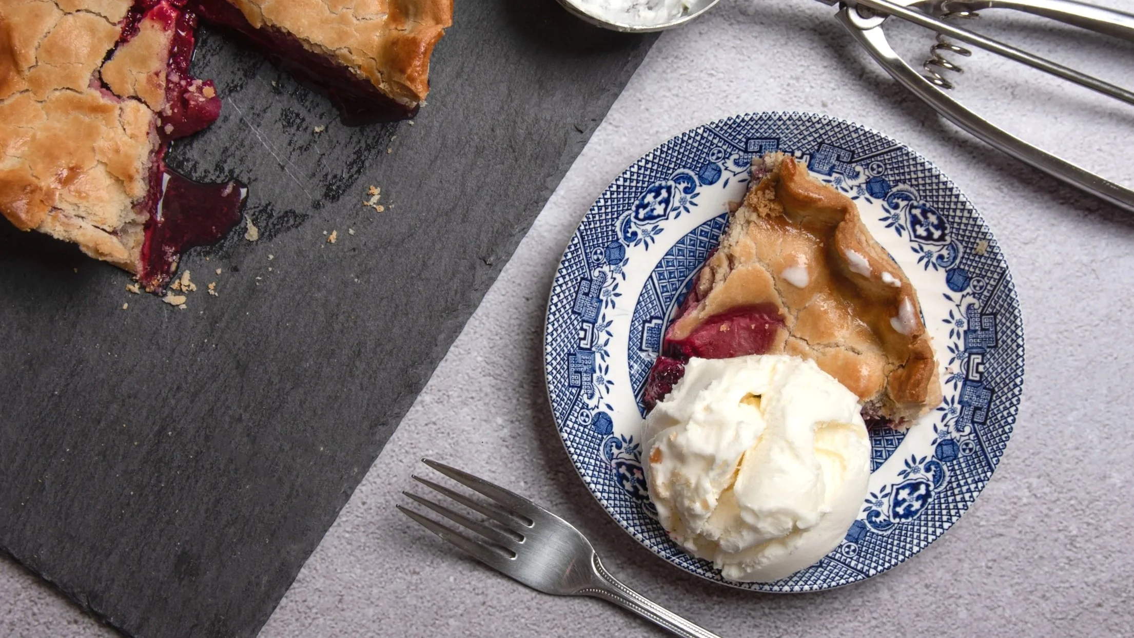
Image: pie slice with ice cream, shot from above, blue background
To carry that same complementary colour logic through the whole scene, I photographed the pie alongside silver, blue, and grey-toned props. An ice cream scoop and a fork, the kind of thing you'd naturally use to eat the pie. I nearly always choose complementary colours for props like this, because it keeps the food as the clear hero of the shot rather than competing with its surroundings.

3. Bringing in a serving idea
Next, I thought about how the pie might be served! A slice alongside ice cream, or custard.
This shot was taken from directly above, with a pop of blue added to the background. Again, a complementary colour to the pie's warm tones. This is genuinely one of my favourite images from the set; the blue really lets the food take centre stage.
4. Using focus to tell a story
As a bit of an experiment, I wanted to see whether focus alone could change the story an image tells, without changing the setup at all. I took two images: one with a small scoop of ice cream lifted on the fork, and one with the fork simply resting on the plate.

Small shift, quite different feeling:
· The first image, with the ice cream coming toward you, feels active, mid-bite, inviting you in.
· The second, with the fork resting, feels more like a pause and maybe the person is full, or simply savouring the moment.
It's a nice reminder that you don't always need a new setup to tell a new story, sometimes just shifting focus is enough.
In summary
This shoot pulled together a few things I think about on every food shoot: taking a little inspiration from other imagery I'd come across, thinking carefully about colour theory, and using focus to give a single image its own sense of story.
I hope this behind-the-scenes look has been useful and hopefully a little less intimidating than "colour theory" sounds on paper.
Do you want to take your own food photography to the next level? I'd love to help.
Book a personalised 1:1 photography session and learn flat lay setups, colour theory, lighting, and styling. All explained simply, with plenty of room for questions.
Not sure how to style or photograph food for social media or seasonal promotions? That's exactly the kind of thing I'm happy to chat through, with no pressure, just a friendly conversation about your goals.